








Presets, colours, background as an image, gradient or video, button style, font and the surface behind the content in the Theme tab.
In the builder's “Theme” tab you set the look of the whole page: colours, background, button shape and font. All changes except custom CSS are saved to the draft automatically after about 2 seconds and go live the next time you publish.
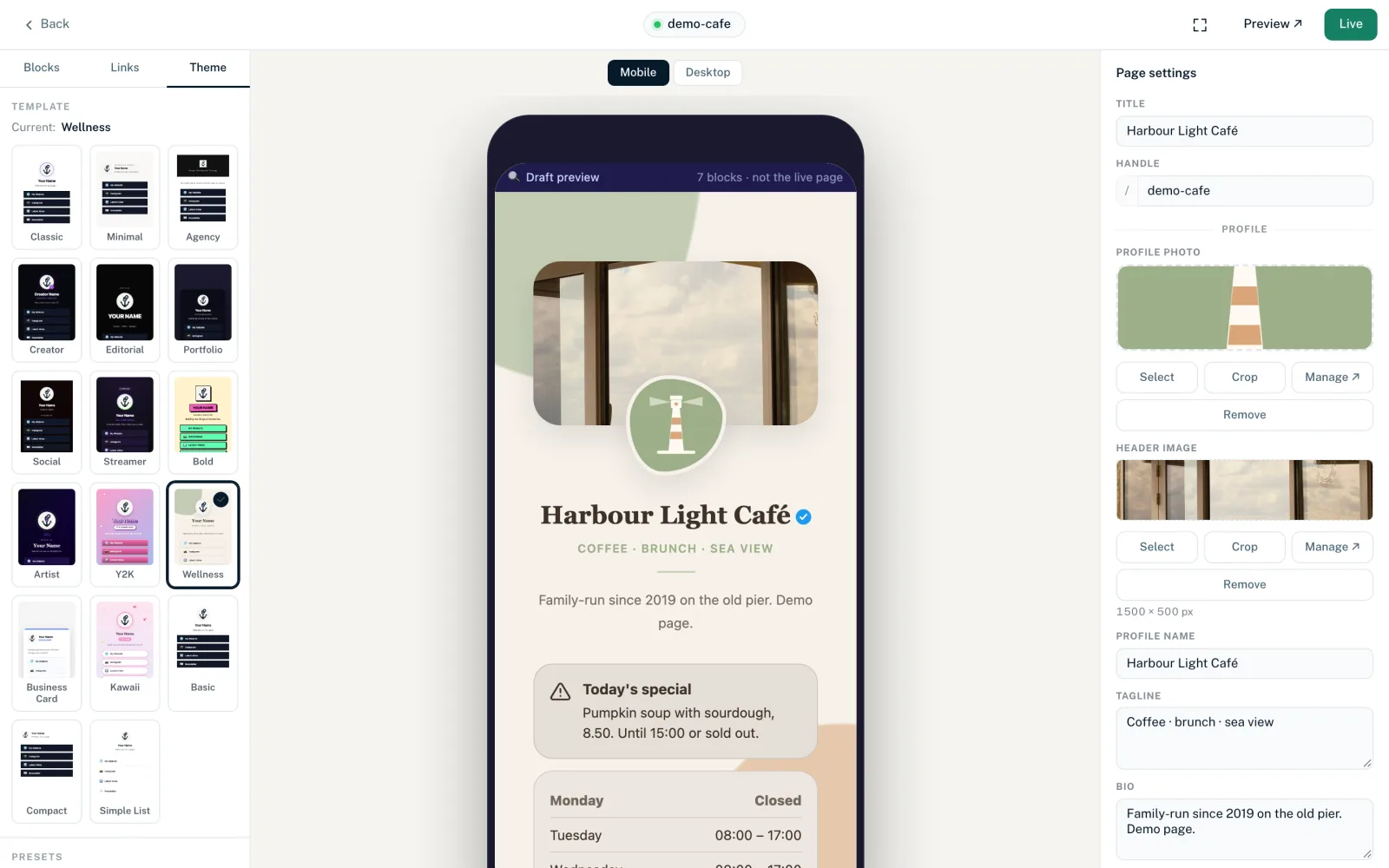
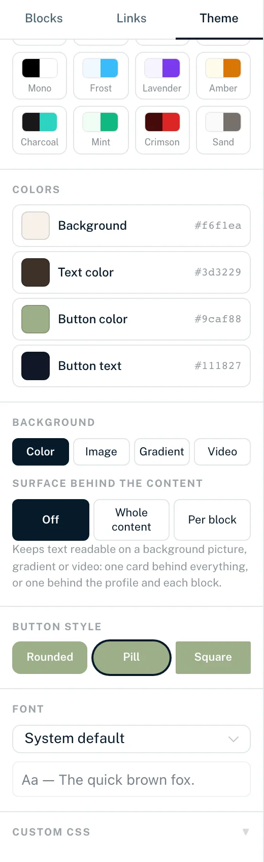
The tab is laid out from top to bottom: “Template”, “Presets”, “Colors”, “Background”, “Surface behind the content”, “Button style”, “Font” and “Custom CSS”. Templates have an article of their own.
Presets
Presets are ready-made colour combinations. One click sets the background colour, text colour, button colour and button style at once and resets your own button text colour. There are 16 presets: Classic, Midnight, Harbor, Ocean, Forest, Sunset, Rose, Slate, Mono, Frost, Lavender, Amber, Charcoal, Mint, Crimson and Sand. The active preset is marked as long as you don't change any of the four values.
Colours
Four base colours, each with a colour picker and hex value (no transparency):
- “Background”
- The page's background colour; also used when the background type is “Color”.
- “Text color”
- Colour for name, bio and texts.
- “Button color”
- Colour of the link buttons and default colour for buttons in blocks.
- “Button text”
- Text on the buttons. Without your own choice, a colour that reads well on the button colour is picked automatically.
The value shown is always the one currently in effect, even if it comes from the template. Many blocks have their own colour fields under “Display options”. As long as they show “Default (from theme)”, they follow these colours.
Background
The “Color”, “Image”, “Gradient” and “Video” buttons set the type of page background. When you switch, the builder remembers the values of the other types for as long as you stay in the builder.
Colour
The page uses the “Background” colour from the “Colors” section.
Image
- “Desktop image”
- Background for large screens, 1920 × 1080 px.
- “Mobile image”
- Optional, portrait 1080 × 1920 px. When empty it shows “like desktop”, and the desktop image is used.
“Select” opens your assets, “Manage ↗” the assets page, “Remove” takes the image out. If an image is not exactly the target size, the crop tool opens and the cropped image is saved as a new asset. More in Images in the Page Builder.
Gradient
- “Start colour” and “End colour”
- The two colours of the gradient.
- “Angle”
- Direction from 0 to 355 degrees in steps of 5.
- “Presets”
- Ready-made gradients: Indigo, Sunset, Ocean, Forest, Berry and Midnight.
Video
- “Desktop video”
- A direct link to a video file (.mp4 or .webm), or “Select video” from your video assets.
- “Mobile video”
- Optional, e.g. a smaller file for mobile data. When empty, the desktop video is used.
The video plays muted and on a loop, without controls. For visitors who have turned on reduced motion in their system settings, it is hidden. Files up to 8 MB in MP4 or WebM format are recommended.
Overlay opacity
For image, gradient and video, a slider from 0 to 80% puts a darkening layer over the background so text is easier to read.
A page background made of an image, gradient or video replaces the template's background images. The template's image slots then show a note about this. With “Color” the template images are visible again.
Surface behind the content
Makes text readable on a background image, gradient or video:
- “Off”
- No surface; the content sits directly on the background.
- “Whole content”
- One card behind all of the content.
- “Per block”
- A separate card behind the profile and behind each block.
- “Solid” or “Translucent”
- Appears as soon as the surface is switched on. Translucent lets the background show through.
This setting has no effect with the Business Card template.
Button style
| Style | Corners of the link buttons |
|---|---|
| Rounded | Slightly rounded, 12 px |
| Pill | Fully round |
| Square | Almost square, 4 px |
The button style is the default. You can override it in the Links block and per link (“Corner radius” in both places).
Font
You can choose from DM Sans, Figtree, Sora, Plus Jakarta Sans, Raleway, Inter, Poppins, Montserrat, Nunito, Outfit, Space Grotesk and “System default” (the device's own font). The line “Aa — The quick brown fox.” shows a preview.
LinkHarbor serves all fonts itself. Your visitors' browsers load nothing from Google Fonts or other third-party servers for them.
Which setting wins
Colours and shapes are refined from the outside in:
- Template: basic style and default colours
- Theme tab: colours, background, button style and font for the whole page
- A block's display options: colours and shapes for that block
- Styling of an individual link: takes priority over all other values
- Custom CSS: for anything the controls don't cover
How to fine-tune with your own CSS is explained in Custom CSS.
You might also find this useful
Nothing found?
Tell us what you need, and our support team will help you personally.